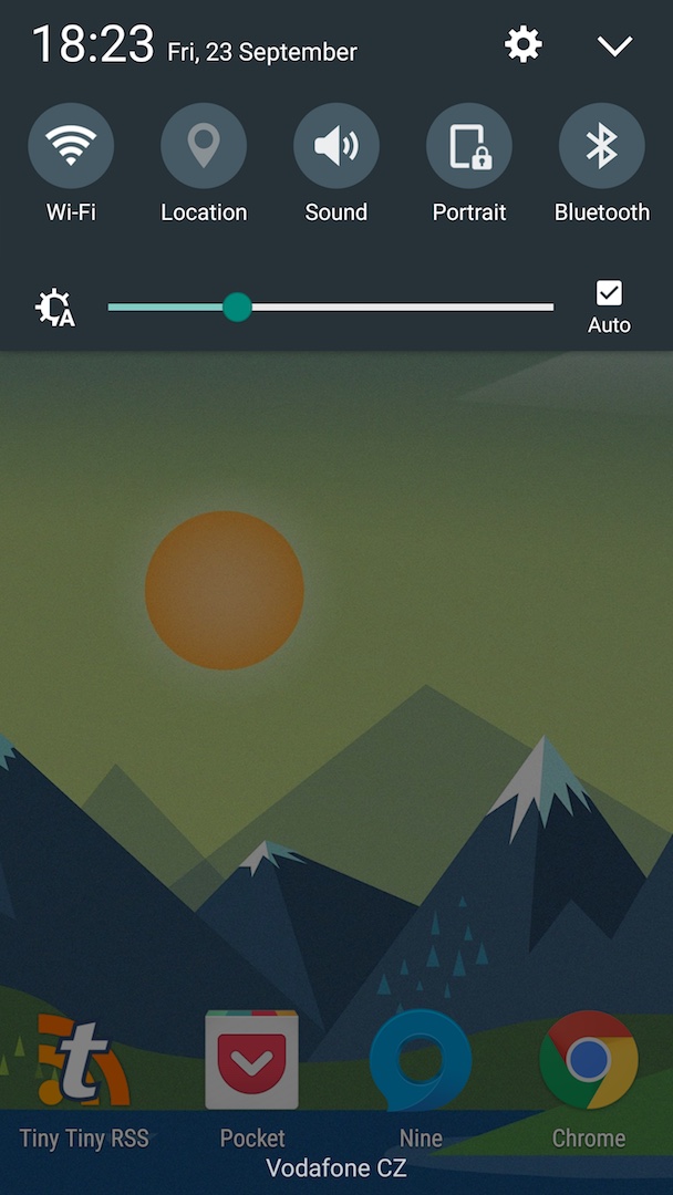
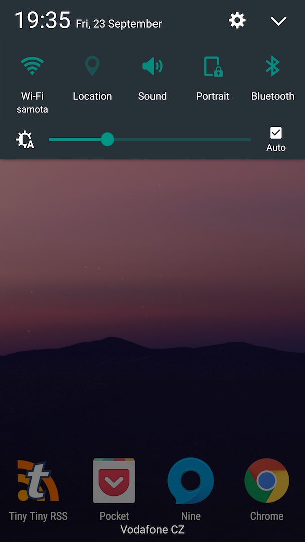
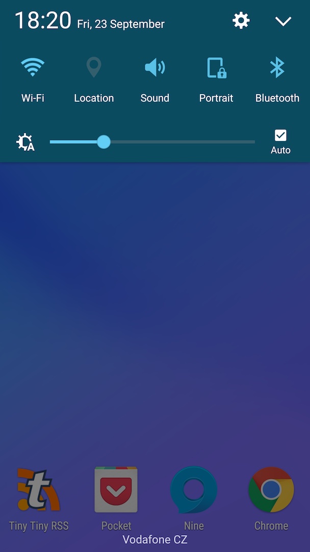
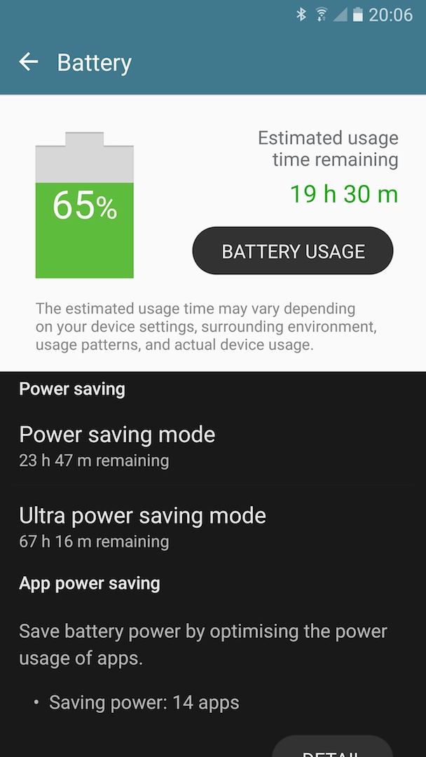
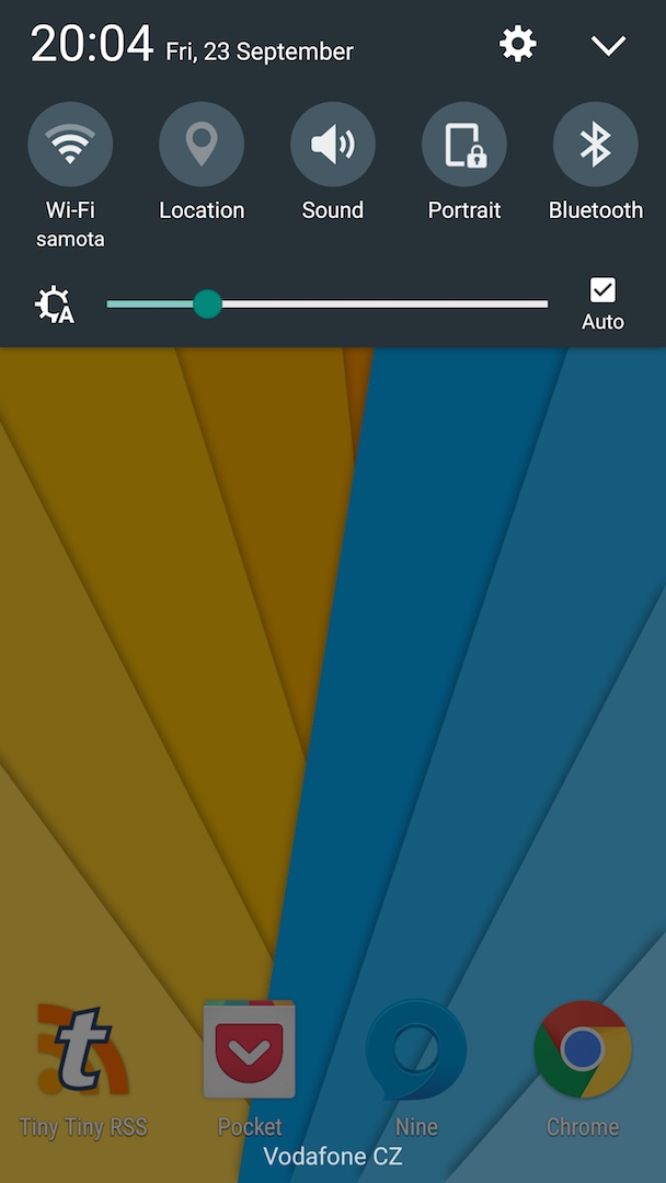
Latest versions of TouchWiz on Samsung Galaxy S7 doesn’t look bad. At least it’s mostly consistent. However I would prefer to have more stock Android looks and colors at least in the notification panel. I’m not a big fan of the white design of notification panel (especially since it’s on AMOLED).
In a hope to find some more stock looking color schema, I tried searching for following phrases in the Samsung Theme store: “AOSP, Marshmallow, Android, stock, material, Nexus”. I installed the majority that was promising cleaner stock like design.
Android 6.0
The notification panel of this theme looks just perfect. What ruins it is the color of the off state of switches/toggles. In AOSP the off state toggles are light grey for a reason. Here the same color makes it extremely confusing with the on state.
Android Flat Theme
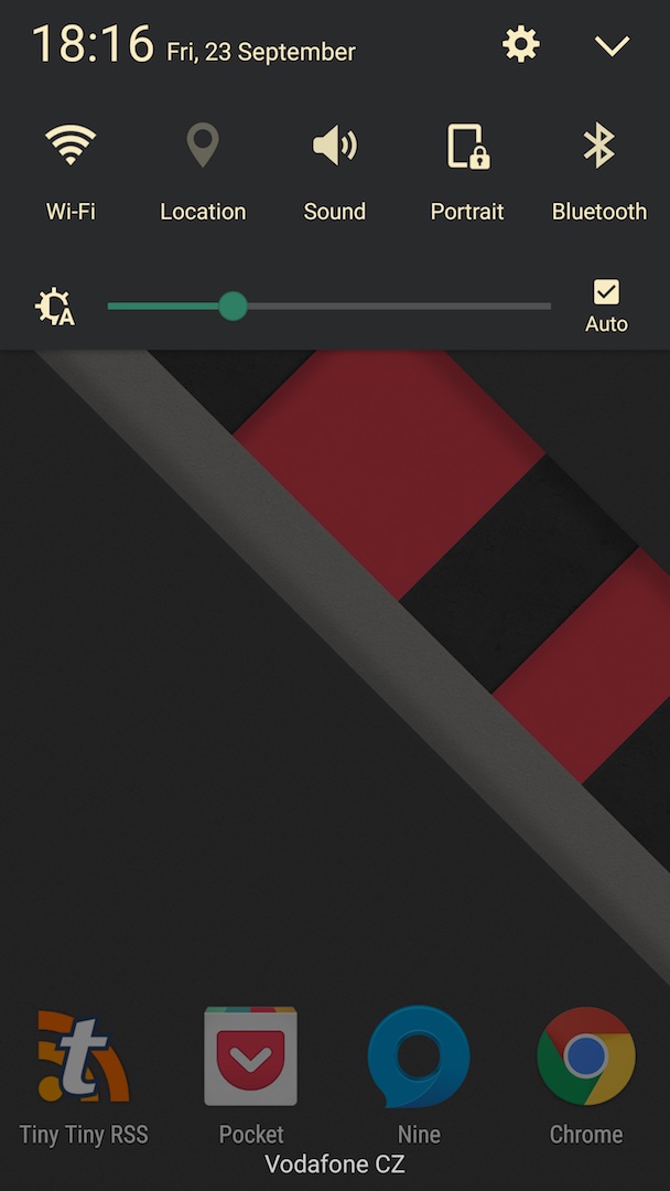
The notification panel in this theme looks pretty good except for the green color of the brightness slider which brings something really distracting and out of this place.
Also the icons are themed. I have nothing against theming icons as it goes towards the stock Nexus look – which this is not.
Android N
It sticks with one color for the notification panel. It’s ok but it just doesn’t feel genuinely stock. Same with the off toggles that should be light grey instead of light green.
Flat_Touchwiz
Part TouchWiz, part iOS/MIUI with its roundish controls. I’m not a fan.
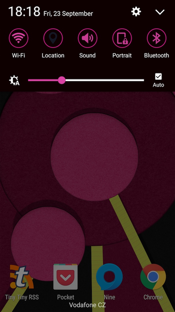
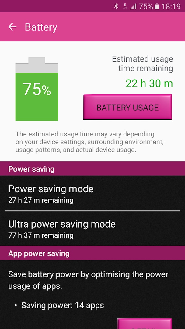
Lollipop
Even if you’re fan of magenta, this is just ugly.
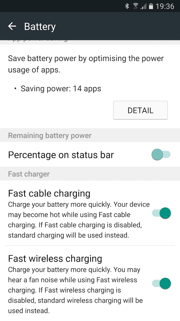
Marshmallow_Dark
The colors in the notification panel may be too subtle. It also brings in round buttons and other inconsistencies caused by black background.
Material Black
The notification panel looks pretty clean but the custom background in ActionBar and themed icons make it less stock like experience.
Material Design Flat Theme
Second (green) color of the brightness slider in the notification panel is just wrong. It also uses not matching color for actions in the ActionBar. It also themes icons.
Simple Black
The toggles in the notification panel are just out of this world. It also themes icons.
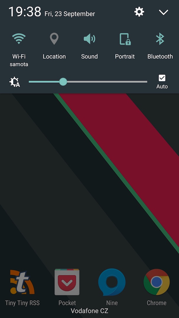
Vanilla
This pretty consistent and nice theme is again ruined by the color of the brightness slide in the notification panel.
Conclusion
Based on trying all these themes I understand that creating full dark theme won’t be without side effects yet it is possible to create almost Nexus like notification panel and toggles. Unfortunately these tiny little inconsistencies in the available themes bug me.
I will further investigate if I should better build my own perfect theme (can I fork some?) or create tweak for my Xposed module app that could disable some parts of themes from applying (if you’re not interested in things like custom icons etc.).