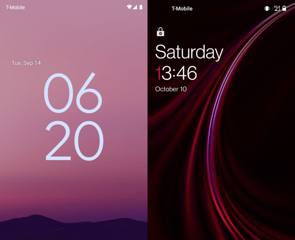
Google is changing the way the lock screen works on Android 12 (Pixel devices). When there are no notifications, the clock enlarges – spans to two lines, with leading zero and without without colon.
OnePlus uses clock on lock screen for branding and paints leading ones in red.

The Google’s clock design is reportedly problematic for people with dyslexia. In OnePlus’s case it’s problematic for people with (partial) color blindness.
Personally, I can’t stand it. It makes it harder to read time in a quick glance at the lock screen.
Neither Google nor OnePlus provide options to change any part of this. On the other hand, manufacturers like Samsung show time in one line and in single color and even offer heavy lock screen customization (in the LockStar app).