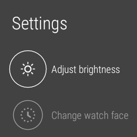
This is how the system Settings menu on Android Wear (Android 6) looks like.
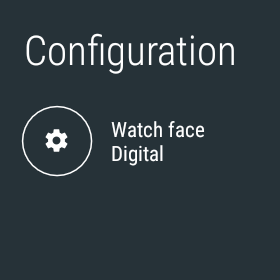
This is Configuration screen for Google’s own (1st party) watch face. Colors, sizes and paddings slightly differ.
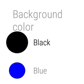
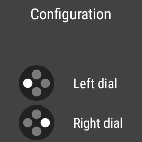
On the other hand, these are the configuration screens from Watch Face sample which is provided directly by Google.
Seems like the only common thing is implementation of WearableListView while the followed design patterns are completely different – or just there were none followed.
Based on various Android Wear Design guides (Material Design for Wearables), it looks like Google does care.
Good design needs to be consistent. Why is there no template for a menu that will fit 90% of Android Wear applications? It is possible to create good universal layouts that would avoid having more junk cluttering Wearable platform so why Google doesn’t do that in their main and up to date sample?